2026 Kitchen Cabinet Color Trends Designers Are Loving Right Now (And How to Use Them Beautifully)
Choosing the right cabinet color can completely change how a kitchen feels. Cabinets are the foundation of the space — they influence your countertops, hardware, lighting, and even how large or cozy the room looks.
And in 2026, kitchen design is moving toward softer, warmer palettes that feel more personal and lived-in—goodbye stark white, hello cozy, character-filled kitchens.
Instead of overly glossy finishes or stark cool tones, designers are leaning into colors that bring comfort and depth.
Think earthy stains, calming greens, and subtle pastels that still feel timeless. If you’re planning a refresh or just looking for inspiration, these are the top kitchen cabinet color trends for 2026 — plus ideas on how to use them in a way that won’t feel outdated next year.
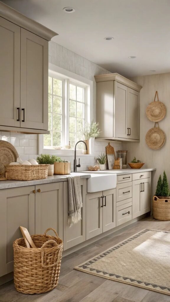
1. Warm Neutrals: The New “White” Kitchen
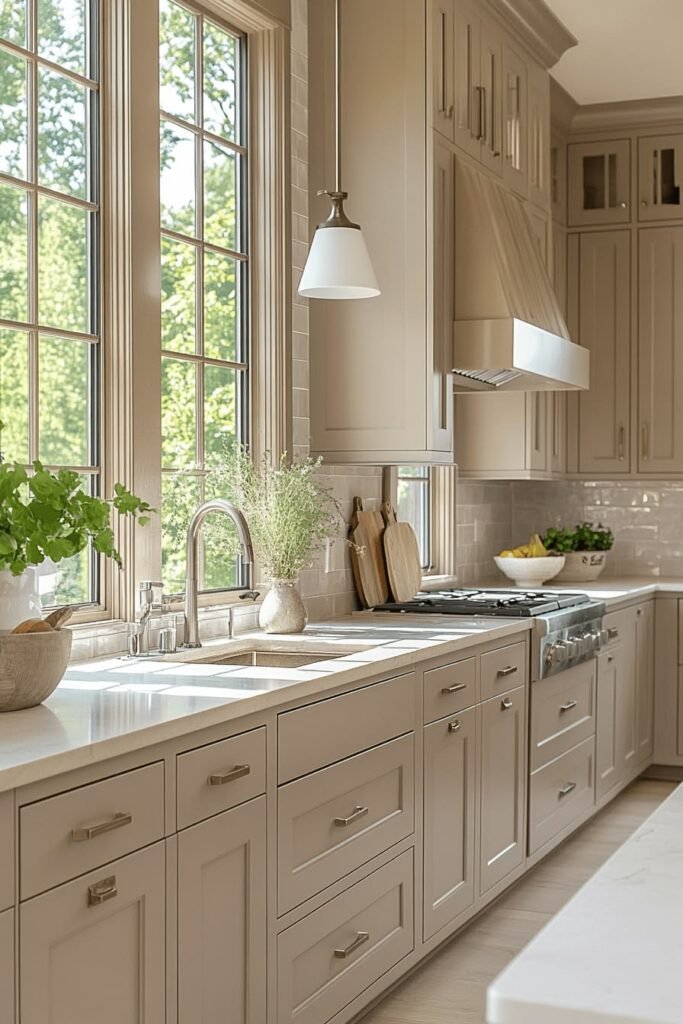
After years of bright white, designers are shifting to beige, cream, mushroom, and greige that feel softer and more lived-in. These colors still keep a kitchen bright but add a subtle warmth that’s flattering in both natural and artificial light.
How to use them beautifully:
- Pair warm neutral cabinets with veined stone or quartz countertops, light oak or medium wood floors, and warm off-white or light greige walls.
- Choose hardware in brushed brass, champagne, or warm nickel to keep the overall palette cohesive and inviting.
- Use these shades on perimeter cabinets, then add a deeper accent on the island for gentle contrast.
2. Nature-Inspired Greens
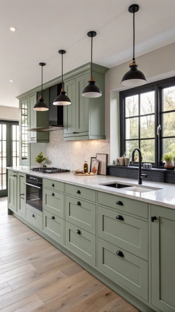
Sage, olive, moss, and deep forest greens are now considered modern “new neutrals” in kitchens. They echo the outdoors and instantly make a space feel calm, grounded, and sophisticated rather than trendy.
How to use them beautifully:
- Try sage or soft olive on lower cabinets with creamy upper cabinets or open shelving to keep the room light.
- For a bolder look, paint all cabinets in a muted forest or moss green and balance with light stone counters and warm wood accents.
- Pair with aged brass, brushed gold, or matte black hardware, and keep walls in warm ivory or light greige so the green remains the star.
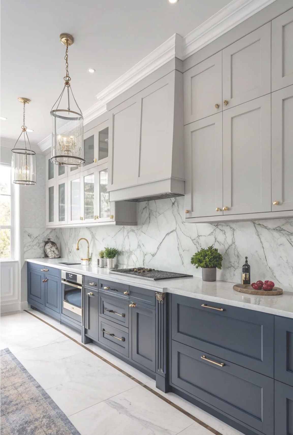
3. Deep Blues and Teals
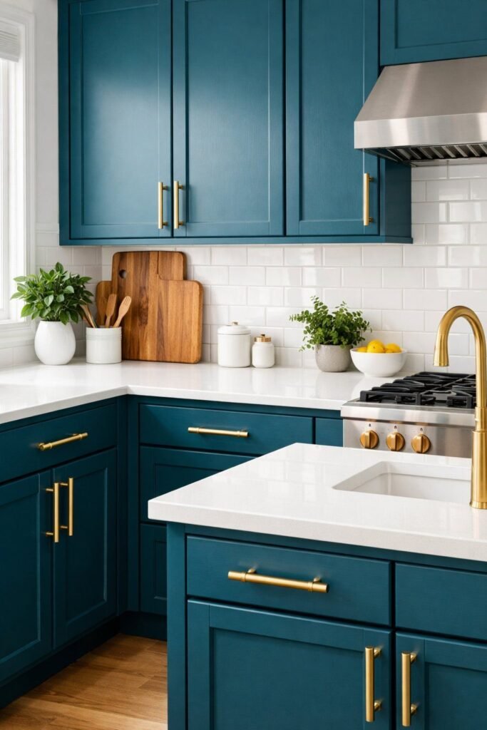
Rich navy, inky blue, and deep teal are sticking around as designer favorites because they add drama without feeling harsh. These shades work especially well in open-plan homes where the kitchen is visible from living spaces.
How to use them beautifully:
- Use navy or deep teal on an island or base cabinets and keep uppers lighter (cream, warm white, or pale greige).
- Combine with walnut or oak accents—open shelves, panels, or a wood hood—to keep the look warm rather than cold.
- Choose marble- or quartz-look counters with soft veining and pair with brass or polished nickel hardware for a classic, elevated feel.
4. Earthy Terracotta, Caramel, and Ochre
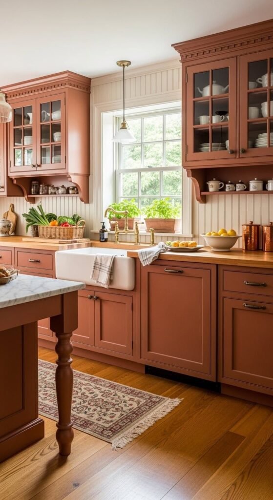
Earthy hues are rising fast: think terracotta clay, caramel, tobacco, and soft ochre. These tones feel artisan, cozy, and very custom, especially in combination with textured tile and natural stone.
How to use them beautifully:
- Consider terracotta or caramel on an island, pantry wall, or a bank of lower cabinets instead of your whole kitchen.
- Balance the warmth with neutral counters (ecru, sand, or light stone) and natural wood like smoked oak or light walnut.
- Avoid cool blue-toned whites on the walls; instead, choose warm off-whites, sand, or a chalky limewashed finish.
5. Rich Woods: Oak, Walnut, and Mixed Species
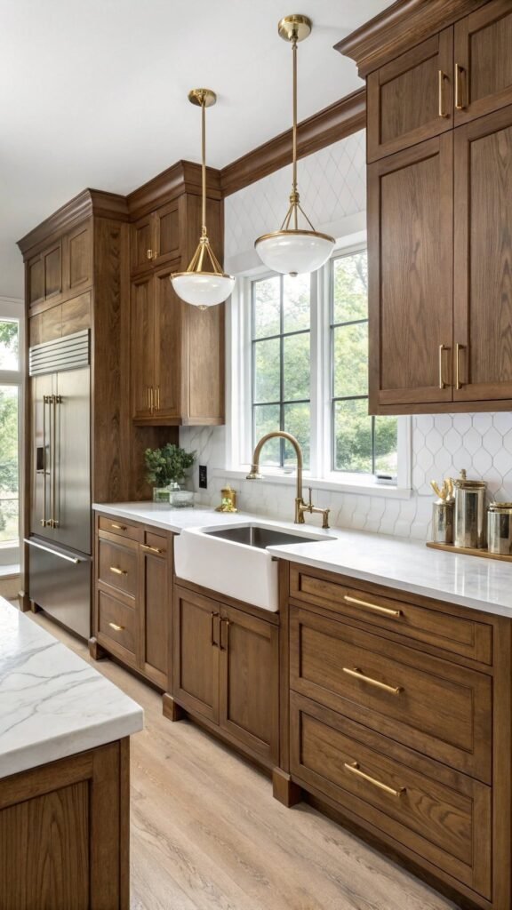
Real wood cabinetry is back in a big way, with designers celebrating the grain instead of covering it with paint. Light white oak, rift-cut oak, mid-tone oak, and dark walnut are all popular, often mixed within the same kitchen.
How to use them beautifully:
- Combine painted uppers with wood lowers or a wood island so the room doesn’t feel too heavy.
- Use vertical or rift-cut grain for a more modern look; choose a mid- to matte sheen to keep it current.
- Pair warm woods with stone or stone-look countertops and simple slab or Shaker doors for a timeless feel.
6. Burgundy, Deep Reds, and Heritage Tones
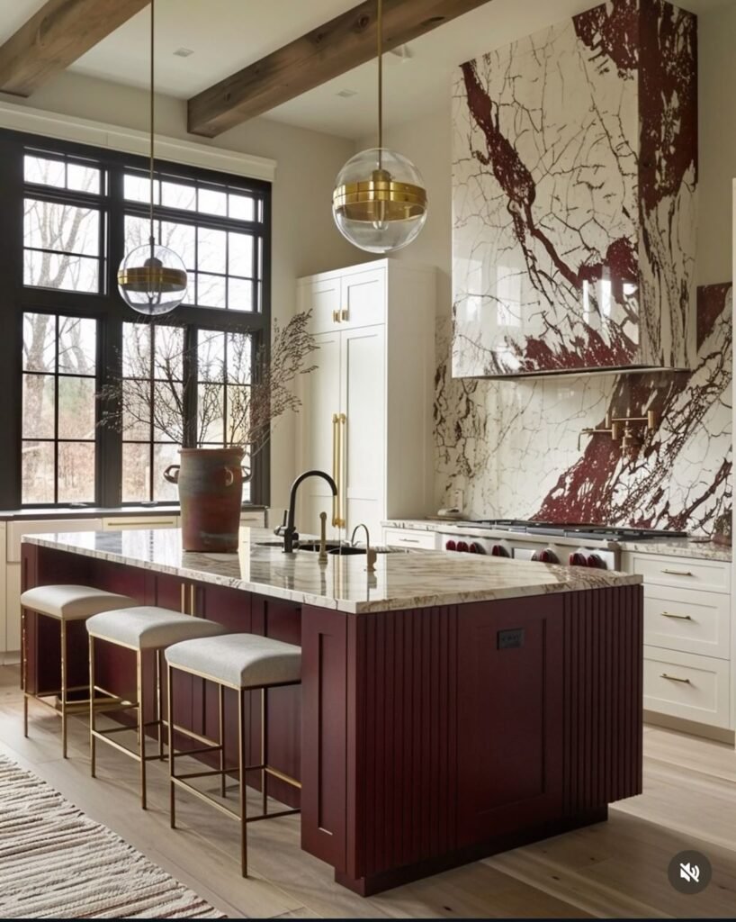
Designers are predicting more deep reds, burgundies, and other heritage tones (ink blue, aubergine, smoky plum) for clients who want mood and drama. These work beautifully in larger kitchens, galley spaces with good light, or butler’s pantries.
How to use them beautifully:
- Use burgundy or deep red on a feature island, bar area, or lower cabinets, keeping walls and uppers in warm neutrals.
- Combine with classic stones like marble or marble-look quartz and metallics like polished nickel or chrome for a tailored, slightly retro feel.
- Consider tone-on-tone: use the same color on cabinets and walls in different strengths for a cocooning effect.
7. Soft Greys and Greige (But Warmer)
Grey isn’t gone—it’s just warmer and more complex. Instead of flat, cool grey, designers are choosing greige, mushroom, and “mushroom taupe” tones that bridge beige and grey. These shades feel sophisticated and pair well with both warm and cool materials.
How to use them beautifully:
- Use greige cabinets with warm stone counters and wood flooring for a modern, high-end look.
- Mix with black accents (hardware, light fixtures) to define the space without making it harsh.
- Add texture through backsplash tile (zellige, handmade-look tiles, or subtle pattern) rather than relying solely on color.
8. Black and Almost-Black
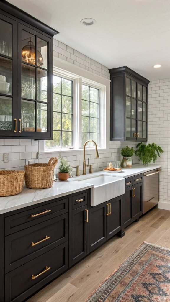
Black and near-black (ink, charcoal, espresso) still have a strong presence—but in softer, more livable ways. Matte or satin finishes and slightly warm undertones make dark cabinets feel sophisticated instead of stark.
How to use them beautifully:
- Use black on a lower run of cabinets or an island, paired with lighter uppers and walls to avoid closing in the space.
- Combine with warm wood, brass, and creamy counters to keep the room inviting.
- Choose simple, clean-lined doors so the dark color looks intentional and modern, not heavy.
9. Two-Tone and Layered Color Schemes

Instead of one flat color, 2026 kitchens often mix two (or even three) cabinet colors to create depth. Think: warm neutral perimeters, deep color on the island, and wood accents.
How to use them beautifully:
- Classic trio: warm off-white uppers, sage or navy lowers, and an oak island.
- Subtle combo: greige perimeter cabinets with a deeper mushroom or taupe island.
- Balance bold shades with plenty of light: walls, backsplash, and counters should support and calm the palette.
What Kitchen Cabinet Trends Are Fading in 2026?
While trends evolve, certain styles are slowly stepping aside:
- Ultra glossy finishes are being replaced by matte textures
- Cool gray palettes feel less popular compared to warm neutrals
- All-white kitchens are shifting toward layered tones and natural materials
The focus now is less about perfection and more about creating kitchens that feel welcoming and personal.
How to Bring 2026 Kitchen Cabinet Trends Into Your Home?
You don’t need a full renovation to embrace these ideas. Small changes can make a big difference:
Questions to ask:
- How much natural light do you get?
- Low light: choose warm neutrals, soft greens, or light woods.
- Lots of light: you can go deeper—navy, forest green, burgundy, even black.
- What’s your home’s overall style?
- Modern/minimal: greige, black, deep teal, oaks, and slab doors.
- Classic/transition: creams, navy, sage, walnut, and Shaker fronts.
- How long do you plan to stay?
- Long term: choose colors you truly love and that suit your architecture.
- Short term/resale: go for warm neutrals or greens with wood accents and add bolder color in island or paint/wall décor.
✔ Test paint samples in natural and artificial lighting
✔ Mix wood and painted cabinets for depth
✔ Add color through islands or pantry cabinets first
✔ Choose hardware finishes that complement warm tones
Designers agree that the most successful kitchens blend trend awareness with timeless materials. The goal isn’t to follow every new idea — it’s to create a space that feels balanced, functional, and uniquely yours.
Finishes and Details That Make Any Color Look High-End
Color is only part of the story—finish and details decide whether your cabinets look designer-level.
Key tips:
- Choose matte or low-sheen finishes to highlight rich, grounded colors and textures.
- Keep door styles simple: Shaker, slim Shaker, or slab look most current and let the color shine.
- Use high-quality hardware in a warm metal (brass, bronze, champagne) or classic nickel/black, sized generously so it feels substantial.
- Repeat your cabinet color or undertone in other elements (textiles, bar stools, art) to make the room feel cohesive.