16 COMMON INTERIOR DESIGN MISTAKES AND HOW TO FIX THEM
Designing a living room that is both beautiful and functional can be a challenging task. Many of us dream of creating a space that feels inviting, stylish, and comfortable, yet we often find ourselves making common mistakes that detract from the room’s overall appeal.
Whether it’s pushing all the furniture against the walls, choosing the wrong scale for furniture, or neglecting proper lighting, these errors can make even the most carefully chosen pieces look out of place.
In this blog post, we’ll explore the top 16 most common living room design mistakes and provide practical tips and tricks on how to fix them.
From mounting your TV too high to overlooking the art of layering, these insights will help you transform your living room into a space that truly reflects your style and meets your needs.
1. Pushing All Furniture Against the Walls
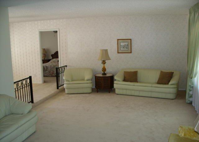
Pushing your furniture against the walls might seem like a space-saving solution, but it can make your living room look like you’re parting the Red Sea, with a vast expanse of space in the middle that can be visually unappealing and impractical for day-to-day living.
Instead of fostering intimate conversation areas, it creates a sense of emptiness in the center of the room, making the space feel more like a waiting area than a cozy living room.

When furniture is placed exclusively against the walls, it can also disrupt the natural flow of the room. This arrangement often fails to highlight the room’s focal points, such as a fireplace, a beautiful window, or a piece of art, leading to a lack of visual interest and coherence in the overall design.
The Fix: Creating Intimate Seating Areas
To fix this common mistake, start by rethinking your room’s layout.
Consider floating your furniture away from the walls to create more inviting and functional seating areas. Begin with a central piece, like a sofa, and then arrange supporting pieces such as armchairs and coffee tables around it to form a cohesive grouping.

PHOTO: JUSTIN COIT
This layout not only promotes better conversation and interaction but also makes the room feel more balanced and thoughtfully designed.
If you’re unsure about the best way to arrange your furniture, start with a sketch of the space.
You can use pen and paper or leverage interior design software like Rayon to draw floor plans quickly and accurately.
This tool allows you to experiment with different furniture placements and helps you to find the optimal layout for your living room.
2. Ignoring Traffic Flow
Pay attention to the natural paths you take to move around the room.
Traffic flow refers to the natural paths people take to move through a space, and when these paths are obstructed, it can lead to a cramped and uncomfortable environment.
This oversight often results in awkward layouts where furniture becomes a physical barrier, making it difficult to navigate the room smoothly.
For example, placing a sofa directly in front of a doorway, crowding a passage with bulky furniture, or failing to leave sufficient space around a coffee table.
The Fix: Planning for Smooth Navigation
To correct this mistake, it’s essential to plan your room’s layout with traffic flow in mind.
Start by observing the natural paths people take to move around the room and between key points, such as from the door to the sofa or from the kitchen to the dining area.
Allow roughly 36 inches for major walkways to accommodate comfortable movement and at least 24 inches for smaller spaces where traffic might be lighter.
Avoid placing furniture in a way that blocks doors or other entry points. This means taking into account the swing of a door and making sure there is enough clearance for it to open fully without hitting any furniture. If space is tight, consider using furniture that can double as storage or seating to minimize clutter and maintain an open, airy feel.
3. Mounting Your TV Too High
We’ve all been there: settling into the couch for a movie night, only to find ourselves craning our necks uncomfortably upwards to watch the TV.

Mounting your TV too high on the wall is a common design mistake that can have a significant impact on your viewing experience and the overall feel of the living room.
Firstly, it creates a physical strain. Continuously tilting your head upwards to see the screen can lead to neck and back pain, especially during longer viewing sessions.
Secondly, a high-mounted TV disrupts the visual harmony of the room. Ideally, the TV should integrate with the other elements in the space. When placed too high, it becomes a dominant and visually jarring focal point, drawing attention away from other design features and creating an unbalanced composition.
The Fix: Positioning Your TV at Eye Level
To ensure both comfort and aesthetic balance, position your TV at eye level when seated.
This means that the center of the TV screen should be about 42 to 48 inches from the floor, depending on the height of your seating.

If you have a fireplace in your living room, it can present a unique challenge for TV placement. Many people are tempted to mount their TVs above the fireplace, which often results in a too-high placement.
Instead, consider using a mantel mount, a specialized bracket that allows you to pull the TV down to a more comfortable viewing height when in use, and push it back up when not. This solution maintains both the functionality and the aesthetic appeal of your living room.
You can also position the TV on a perpendicular wall to the fireplace. This arrangement keeps the TV at an appropriate height while allowing the fireplace to remain a focal point.
In larger rooms, you might also consider creating separate zones: one for TV viewing and another for enjoying the fireplace. This setup can enhance the overall layout and usability of the space.
4. Hanging Artwork Incorrectly
Hanging artwork is like dressing a room – it adds personality and completes the space.
One of the most common mistakes is hanging art too high, which can leave your walls feeling bare and the artwork itself looking out of place.
Another common mistake is choosing artwork that doesn’t suit the dimensions and orientation of the wall.
For instance, placing a small, vertical piece of art on a long, horizontal wall can make the artwork look out of place and the wall appear even more expansive and empty.
This disproportionate arrangement fails to utilize the wall space effectively, detracting from the overall aesthetic of the room.

Image: Sam’s Original Art
The Fix: Proper Artwork Placement
The golden rule for hanging art is to aim for eye level when standing or seated, typically around 57 to 60 inches from the center of the artwork to the floor.
This is the height where your eye naturally falls, allowing you to comfortably appreciate the piece without craning your neck.
Consider the size and orientation of your artwork in relation to the wall. For expansive walls, a single large piece or a well-balanced gallery wall can create a statement.
However, in long and narrow spaces, horizontal pieces will complement the proportions better than tall vertical ones.
When hanging art above furniture like a sofa or sideboard, maintain a cohesive relationship. Aim for a spacing of 6 to 10 inches between the bottom of the artwork and the top of the furniture.
If you have multiple pieces of artwork, consider creating a gallery wall or a grouping. Arrange the pieces so that they form a unified composition, with consistent spacing between each piece like 2 – 4 inches. When creating a gallery wall, start with the largest piece at eye level and build around it,
You can also use painter’s tape to mock up the layout on the wall before hammering in nails, allowing you to visualize and adjust the arrangement before committing.
5. Choosing the Wrong Scale for Furniture
Avoid oversized furniture in small living rooms and undersized items in large spaces.
Use the 2/3 rule: the sofa should be 2/3 the width of the wall, the coffee table should be 2/3 the width of the sofa, and artwork should be about 2/3 the width of the sofa.
6. Poor Lighting Choices
Relying only on overhead lighting makes a room look dingy and uninviting. Use a combination of ambient, task, and accent lighting. Mix ceiling, table, and floor lamps, and consider the light’s temperature, aiming for 2700 to 4000 Kelvin for a cozy feel.
7. Matching Furniture Sets
Matching furniture sets can make your living room look like a showroom. Mix and match new and vintage pieces, different styles, and materials to create a unique and inviting space.
Look for common threads like material, style, or color to tie everything together.
8. Not Layering Textures and Materials
A lack of layering can make a room feel flat. Introduce different textures, materials, shapes, tones, and scales for depth and richness. Contrast elements like hard and soft, dark and light, and matte and glossy, to create visual interest.
9. Prioritizing Looks Over Comfort
Don’t choose furniture purely for its appearance. It needs to be functional and comfortable for your lifestyle. Consider materials that are kid and pet-friendly, and ensure that pieces like sofas and chairs are comfortable to use daily.
10. Using the Wrong Size Rug
An area rug that’s too small can make your living room look unbalanced. Ensure the rug is big enough to fit the front legs of your sofa and chairs or all four legs. If you already have a small rug you love, layer it with a larger plain rug underneath.
11- Avoid Clutter
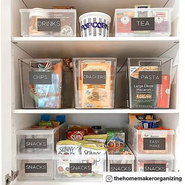
Clutter is the enemy of a well-decorated space. Use storage solutions like long units, vertical storage, and multifunctional furniture to keep your living room tidy. The 80/20 principle suggests keeping 80% of items in closed storage and 20% on display.
12- Choosing the Wrong Paint Finish
Choosing the wrong paint finish can affect both the look and durability of your walls.
Flat or matte paints are unsuitable for high-moisture areas like kitchens and bathrooms.
Opt for semi-gloss or eggshell finishes for these spaces. Eggshell is a safe choice for most areas, as it combines durability with a mostly matte look.
13. Overloading Patterns
Using too many patterns in one space can create a chaotic and messy look.
Break up patterns with solids and textures to create balance. Use different scales of patterns to avoid competition between elements and achieve a harmonious design.
14. Disregarding Functionality
A well-designed home merges form and function. Think about your daily life and how you use your space. Integrate storage solutions and functional pieces that help reduce clutter and enhance usability.
16. Neglecting Furniture Legs
Furniture legs can significantly impact your home’s style.
Maintain a consistent design style with your furniture legs, or balance different leg styles by pairing pieces with distinct legs with those without legs. This approach ensures a cohesive look.


